Please Respect My Work...

All of the cards, layouts, handmade items and art work displayed on this website are copyright to me, Lynne Mizera. Of course I hope to inspire and encourage you and would be morethan happy for you to use any of my work to that end; however, please respect me and my work and do not directly copy any of my projects without crediting me or enter any of my work into any magazines or competitions without my express written permission. All my cards, layouts, projects and art work are not to be used by any commercial enterprise for any financial, marketing or commercial gain.

Friday, May 27, 2016

The Sisterhood of Snarky Stampers - "N" is for NOT a Card

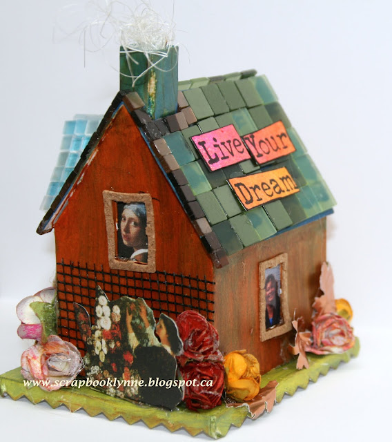
Happy Day everyone!  I cannot wait to share my latest project with you today, created for the Sisterhood of Snarky Stampers 60th Challenge: "N" is for Not a Card...
I must say that making this was the most fun I have had in a very long time!  And as I was making it there were so many ideas for variations on the theme flooding into my brain that I actually had to go walk outside to calm down my creative self!
The idea to add faces peeking out of the windows came to me early on in the process... but the idea of adding ME peeking out came to me when I had only one empty window left to fill.  And of course, why limit "me" to just a face when I could add my entire figure?
And after adding myself to this project the house took on an entirely different kind of energy and has now become my own personal and empowering charm that I will be looking at all year long to remind myself of what I want to remind myself about (smile).
I cannot stop adding little personal items to this wee house that have meaning only to me.  I want to make MORE and MORE of them, each one in the image of a person I Love or Admire.
You will want to stay tuned to see more of these wonderful little creations - so please do come back to visit! Grin
Now for those of you that want to know, I used the Sizzix BIGZ XL Die #660992, Village Dwelling to make my house.  Please check out the Canadian on-line store Stitch in the Ditch for some of the best Sizzix die selections and pricing I have found anywhere for Canadians. (and NO I am not being paid to say this! Smile).  I used Creative Scrapbooker's Super Stock to create the base house and painted it with my Silks Acrylic Glazes.  The roof was created from my old Harmonie tiles (another defunct Canadian company, sigh) but I have quite a collection and I am so happy I found this perfect use for them.  The images in the windows came my Graphic 45 Renaissance collection, the  first Graphic 45 paper I purchased and which I have been Hoarding! And then I just added everything and anything that appealed to me.  That's all I am sharing for now, except that this wee house has come to mean more to me than even I could have foreseen.  
Now please do pop on over to the Sisterhood to see what my design team mates have created for the "N" is Not A Card" challenge and please do consider linking up one of your own projects for this challenge.  You have until June 10th and we always pick a Queen of Snark and a Princess to serve her!

And just because it is so stinking CUTE (grin) I am linking this project up the following challenges:  

613 Avenue Create Challenge #178 - Anything Goes  

Crafting With an Attitude Challenge #15 - Always Anything Goes

Sassy Studio Designs DTBST #335 - Anything But A Card

As always, thanks for popping by and please do leave me a comment if you like what you see!

Scrapbooking Artist Lynne Mizera
for The Sisterhood of Snarky Stampers

Wednesday, May 25, 2016

What's on YOUR Workdesk Wednesday #364 (the 7th Anniversary!)

SEVEN years?! I know people who couldn't stay married that long! (grin) I am so happy to have found this little weekly blog hop and to be able to participate for the 7th anniversary.  I love Julia Dunnit (from the Stamping Ground) who began it all and I am shamelessly copying a bit from her blog post today so you can see why, after seven years, it is still going strong!
"You're welcome, every week, when you can or just a few times. This is no clique, and as long as you stick to the very few rules, you will always be welcome. I've met loads of you, thanks to LLJ's super WOYWW Crops and her telling me to 'grow a pair'. Most of you have discovered that I am exactly what I say I am, no more no less than an average woman that really, really likes to talk herself up."
So here is my studio this morning, finally a snap of the REAL thing! This is what it looks like on a regular basis because the more room you have the bigger mess you can create! Grin

You would think that with all this shelving keeping everything within easy reach I would be able to put things back just as easily, but that does not seem to be the case!

And Yes! I am participating in the ATC swap this year, so no close up of my desk so you can't see all the lovelies I am making, (that's for next week!) and YES I have extras so please do contact me if you want to swap!
 
Go HERE to see this year's WOYWW #364 post and all the links to work spaces all over the world, being hosted by the lovely Lunch Lady Jan as Julia is on holidays right  now.
ME - no make up, messy hair, messy studio but Big Bright Beautiful Smile!
As always Thanks for popping in and please do leave me a comment if you like what you see!!!!

Scrapbooking Artist, 
Lynne Mizera


Tuesday, May 17, 2016

What's On Your Workdesk #363

Happy Wednesday everyone!  I am participating in this week's What's On Your Workdesk Wednesday's around-the-world peek into other peoples creative spaces that has has been going on for almost seven years. That's right, next week on May 25th is the 7th anniversary of this awesome weekly blog hop event started by Julia Dunnit over at the Stamping Ground.  You can go HERE to read all about the What's and Why's and How to's of this event.
Here is the corner of my studio that I am sharing today, I call it my mixed-media corner and it's the space I set up to do all the messy stuff like using my sprays and stencils and pastes. (note the paper taped to the back of the wall? grin) I have discovered when I am in the creative zone that I am a messy worker and having my sprays all mounted on the wall above my work space makes for both easy finding and even easier putting away.
I found this grey shelving unit at my local Winners store and it is perfect for keeping all my pastes and gesso and gel mediums out of the way but within easy reach.  And I finally found a use for this old fashioned receipt holder that was gifted to me - I keep all my tissues and bubble wrap and mixed media "other kinds of papers" here - again out of the way but where I can see them and remember to use them!
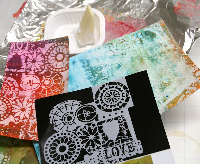
On this paper-covered work surface you are seeing a whole bunch of backgrounds that I am creating for ATC (artist trading cards) and ART swaps with people I know all over the world.  
 
You are also seeing the results of my first attempt at carving my own stamps.  I really love the impressions I get when I used them with paint and with the new Susan K. Weckesser metalic ink.  These backgrounds remind me of East Indian batik fabrics... Swoon!

The other technique I was trying out was using a makeup sponge to blot white gesso ontop of this mask which I placed overtop of my brightly colored sprayed paper.  THIS is a technique I will be definitely doing again.  Now some people out there know these bits are coming and some do not so Shhhhh... Smile.  And if YOU would like to swap with me please contact me by e-mail at scrabooklynne (at) hotmail (dot) com and let's start the dialogue.
Thanks for popping in today for a visit and please do leave me a comment if you like what you are seeing!
Scrapbooking Artist 
Lynne Mizera
     

Friday, May 13, 2016

The Sisterhood of Snarky Stampers - "F" is for FUGLY!

Hello and happy Saturday Blog Land Peeps!  Today I am playing with the Sisterhood of Snarky Stampers and Edna is challenging us to make something Hideous in her "F" is for FUGLY Challenge #59.
 
Now I don't know about you but I just cannot make something ugly (well not on purpose anyway) so I was stumped for bit for this one, but then I remembered the two stamps I had just thrown away and which were STILL in the garbage.  Yes, for the first time EVER I threw something away and the Universe made me go and get it out of the garbage - so What do YOU think that means? - grin  So here's the story:  I Love my Viva Las Vegas stamps and I almost always order a "plate", which is a collection of random images on an 8"x10" piece of rubber, and you always get something you love, something you like and then one or two "not your favorites".  But in this last order I got two stamps I thought were so hideous that I threw them away! My hand hesitated over the garbage bag for an entire minute as my brain tried to find some reason to keep them, but I couldn't, so I dropped them in (and felt quite proud of myself at the time) until not even 24 hours later I was digging them out again!  

And to make it even more interesting... I put her butt on a Wobble and it moves! Giggle
And the even Crazy-er thing is that when I was finished making these two cards my hubby LOVED them! NO seriously, the man who doesn't notice Anything I make and who's opinion - when solicited - is Always "That's really nice, Dear." laughed and laughed and told me he would pay money for these cards - Seriously?!? 

  
More Wobble Action!
So of course I am linking these images up to the Viva Las Vegas May Challenge which is to create something Creepy, Weird. Different and/or Unique... I think I got those covered, don't you?
Here is what I stamped on the inside of this particular card - take it anyway you like!
So do pop on over to the Sisterhood to see what my team mates created and do consider joining in this challenge - you have until 11:59 pm May 27th to link up your FUGLY project - and Hey... That's my Birthday!

As aways, thanks for popping in to see what I am up to and please do leave me a comment if you like what you are seeing!
Scrapbook Lynne Mizera
for the Sisterhood of Snarky Stampers


Planting Seeds... Helping to Build A Room for Hope and Inspiration

Happy Day Blog land Peeps!  Today I am sharing the flag I created to help support the building of an Art room in a school being built by volunteers in Haiti. 
Here is an excerpt right from the Hope for Haiti site:


 "Hope for Haiti is partnering with Creative Scrapbooker magazine and Live Different to help continue building a school in Haiti and bring hope and art to the students who attend and the community they live in... the principal of the school shared their vision to someday have an outdoor "Art Room" that overlooks Cap Haitien below... a place where the students could forget about their difficult lives and just create, dance and play music.

Go HERE to find out all about the Flag Fundraiser and other ways you can help to support this cause. The flags we create will be used to decorate the Art room and to provide inspiration to the students using the room.  Providing inspiration is something very close to  my heart because you never know where those seeds of inspiration you sow will germinate and what beautiful something will grow out of them.  I LOVE sowing seeds!
I made a $35 donation and received this wonderful little package in the mail.  One look at that blank canvas flag and the ideas just started flooding in.
I wanted to create something bright and cheerful and inspiring, but also something that you could see clearly if it was hung up high.  So I decided I would try using my alcohol inks for their bright colors and waterproof characteristics. 
I drew random lines and squiggles on the canvas, not thinking about how or where too much...
Next I added golden circles using this new-to-me Pinata Color metallic alcohol ink by Jacouard called Rich Gold.  It looks amazing (as you can see by the photos).
I picked a flower for my image because it ties in so beautifully with my "Word" this year of GROW, and because I find flowers so incredibly inspiring and uplifting.  I drew the flower on my canvas using purple Sharpie marker...
and then painted all around it with white gesso, fading out the background and making that flower pop...
 Using Susan K. Weckesser's stamp set "Painted Sentiments"  I stamped the word "Inspired" in teal Stayzon ink.  
I pulled out details by outlining them using a black gel pen and signed my name... That's pretty much it.  I am returning this bright little flag to Allison Orthner in the mail today, and I hope it will be a little creative seed for someone on the other side of the world.
This is me with my finished flag in my yard... and YES those are my irises...Swoon
Just in case you want to know more about this wonderful project I am sharing the links to all the supporters of this fundraiser below.  Thank you for popping in today, I hope you enjoyed the lesson! Smile
Scrapbooking Artist
Lynne Mizera

Hope For Haiti Official Site (go to Shop tab for donation options)
Live Different Site (go here to find out about helping to build this school)


Wednesday, May 11, 2016

An Inky FEAST For The Senses!

This month I was honoured to be asked by Susan K. Weckesser if I wanted to be one of the first people to try out and review her new line of inks by ClearSnap: ColorBox Color Pop Minis 

Here are the two cards I created using these inks...
And here is my review: 
I LOVE them!  Grin 
Here are all the things I love about these inks:
The 1"x2" size is perfect, small enough to easily have within reach but large enough to handle most stamping jobs.  The Lid fits snugly so the ink won't dry out and it does not come off when I throw them in a basket (which is my usual modus operandi).
The dye ink colors are vibrant, both when they go on and when they have dried (not always the case with some inks) and they blend beautifully with water - again without fading!
The pigment ink is thick and opaque, just the way I like it, and takes a while to dry unless you use your heat gun - all Good qualities in a pigment inkBut the Metalic ink... Swoon!  Seriously, the best metalic, pigment ink I have come across to date and I have used a LOT of them!  This ink dries Metallic and looks like I used metallic paint - which is what I have resorted to since I have been unable to find a metalic ink that still looks like metal after it has dried - that is until NOW!
And now for the fun stuff.  Because I was trying out a new product I wanted to use these inks in a few different ways and I took photos along the way so you could join in... I hope you enjoy this mini card class and a peek into my creative process.
I decided to ink the background of my cards and then use the white pigment ink to stamp right onto the dark background.  For me THIS is the true test of a both a dark dye ink and a white pigment ink.  Will the dark ink stay dark?  And will the white ink be opaque enough to show up and not fade away?
Not only did both inks pass, but I needed very little of the dark blue ink to create a wash on my background... I used waaaay too much ink! Grin
Then I stamped right onto my background (after the ink had dried of course) with white and gold pigment ink.  I used a masking technique to make the sun appear as if it was coming out from behind the clouds.
You can see how the pigment inks stay crips and bright and how the background ink is still dark even after drying.  Then I did something CRAZY!  I used water with my white pigment ink and painted in the clouds... This NEVER works for me with pigment inks and yet here it is!!
Then I stamped a whole bunch of tiny house images on white 100lbs card stock, grabbed my water brush and started painting in the houses. I used Archival waterproof ink for this part since I knew I wanted to get my images wetThe dye inks acted like a watercolor paint and blended beautifully. 

They worked so well I went and grabbed another of my ColorBox dye inks in yellow, (Not the mini pops 'cuz NO yellow) and it did not work at all!  So this confirms for me that all inks are NOT created equally!  And then I did the same sort of things for the second card in red.
 
The rest of the photos are all about designing and embellishing, using my very favorite techniques of fussy cutting and popping the images, and then using gel pens and Stickles & Liquid Pearls to enhance the card.
Then of course you have to mount the card image onto a card base...

What I love the most about these two cards is how the ink stayed dark and vibrant so the white, un-coloured houses I stamped just jump right off the page... but then that one coloured house becomes the focal point... 

Yup... Great Product and wonderful inks. My one suggestion, MORE Metallic Colors and I NEED a yellow dye ink! Grin 

As Always, thanks for popping by to see what I am up to and please do  leave me a comment if you like what you are seeing!

Scrapbook Lynne Mizera
for Susan K. Weckesser and Clearsnap  
 
The following are a list of stamp sets and products I used for these two "simple" cards... (She says Grinning Madly!)

Susan K. Weckesser/Unity Stamp Sets Used on this Project:
Create Your Day
Celebration of Simple
Tumbleweed Houses
Fly Away
SKW Cardstock - Beautiful Day Dreams
 
ColorBox Color Pop Mini inks
Ranger Stickles and Liquid Pearls
Sakura Gelly Roll Pens
Tsukineko Clear Embossing Powder